
Font Fallback and CLS
…in the context of Core Web Vitals
Loading a custom font (a font which is not known by default by all browsers) can easily introduce some delays in the loading sequence and a CLS (Cumulative Layout Shift) problem. This is true for the first page load on your site, until the font is cached by the browser.
You can try to preload and/or push the custom font, but there will always be a time where the browser will render the body with a default font. This is especially true on slow devices or on a slow connection. You can hide the full body until the font is loaded, but then the FCP (First Contentful Paint) and LCP (Largest Contentful Paint) scores will be highly penalized.
You can also use CSS tricks like font-display: optional, but the font might not be loaded at all on a slow connection: the browser has the instruction to ignore it after a certain (short) delay.
This last solution does not prevent the CLS score to be impacted: when swapping the font, the size of the content might change, and layout might “shift”.
There is another mechanism that can be used to prevent those 2 issues (font loading delay and CLS): use a font fallback.
The idea of the font fallback is to scale a browser default font so that when applied to the content of a page, the content takes up the same "space" with the font fallback and with the custom font. Like this, you can swap one with the other without a layout shift. If you use a default font that looks “similar” enough to the custom font, those few milliseconds of first-time page load will look really close to the experience you want to provide with the custom font. You can then defer the custom font loading or at least make it non-blocking in the loading sequence.
The font-fallback extension
We have built a chrome extension to help compute the font fallback.

When you open the extension on a page, it analyzes the font faces in use on that page: a font face is a combination of font family and font weight. Now for each of those font faces, you can select a default browser font and run the font fallback computation. For each font face, the extension computes which size-adjustment of the default browser font is required so that the content has the same width with both fonts.
The computation happens only on the width because the height should be controlled by the line-height: you should set a line-height on your site to not let the font decide what the height of the text is. This is true for paragraphs, headings, lists…
Note: with font kits, there is a tendency to load many font faces that are never used (or used somewhere else on the site than on the current page). The extension shows also how many are loaded in total. It is also a good indicator if some optimization can be done: optimize the font kit by reducing the font faces it delivers, you can save a lot of bytes to transfer!
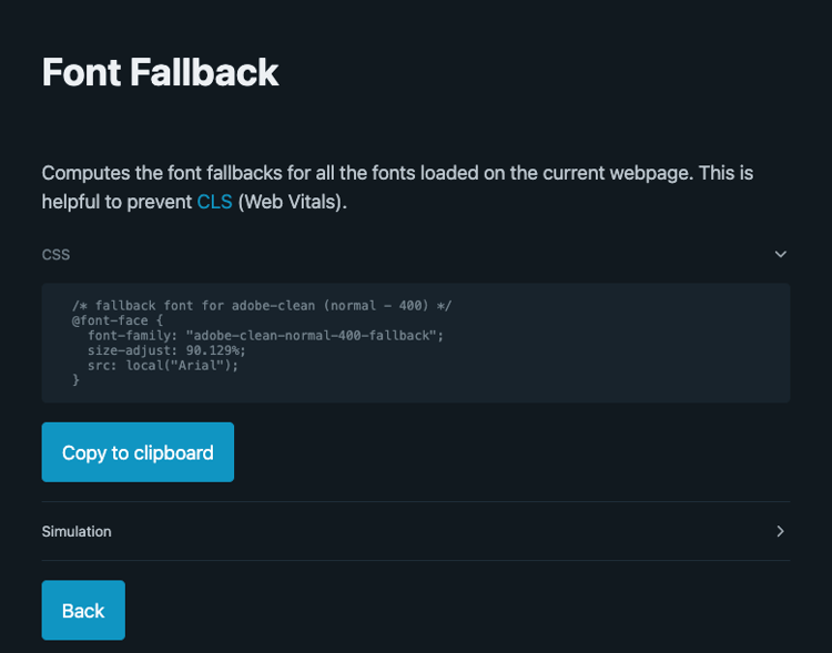
Once the computation work is done, you can copy the computed CSS and paste it in your main CSS.
The generated font families must be added after the custom font in your CSS font-family: the browser will initially not find the custom font, use the fallback until, later, the custom font is loaded. Since they use the same space, the swap does not generate CLS!

To fine tune the font adjust value, you can also use the simulation panel.

Checking the box replaces the custom font by the computed fallback font directly in the page. The text input allows you to change the size-adjust value and immediately visualize the result (you need to toggle the checkbox each time you change the value).
Edge cases
The extension makes a calculation based on an existing site, with existing content and CSS rules. In a different context, the size-adjust may not fit perfectly and the font swap may still produce CLS:
- Content dependency: the text
iiiiihas a smaller width thanmmmmmfor the same number of characters. The number ofmin the text has a bigger influence on the width. But you can find asize-adjustthat matches the average text by running the extension on multiple pages and taking an average of thesize-adjust. - Small container: if your text is in a small container (especially true on mobile) with a restricted width and height, the space allowed to the text is then limited and the computation of the fallback might need to be more precise, i.e. made on this exact text.
You will find more technical details and other tools directly In the extension repository: https://github.com/adobe/helix-font-fallback-extension