SDK UI Components
Experience Workspace provides a way to add Adobe-like styles to your applications and plugins. These components are extremely light due to their minimal footprint, speedy performance characteristics, and simple API. They are called Super Lite (sl).
Note: These components are considered experimental and come with no warranty. Use at your own discretion.
Available components
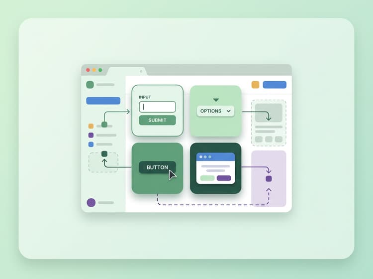
sl-inputis used for text, number, date, and range inputs.sl-selectis used for drop downs.sl-buttonis used for buttons.sl-dialogis used for dialogs / modals.
API
Super Lite's API is designed to be a drop-in replacement for any existing element.
Before
<input type="text" name="firstName" placeholder="Enter first name"/>
After
<sl-input type="text" name="firstName" placeholder="Enter first name"></sl-input>
Notice that there are zero changes to the attributes. To sl-ify your element, you simply:
- Add
sl-to the name of the element. - Add a closing tag.
How to use
html
<!DOCTYPE html>
<html>
  <head>
    <title>DA App SDK Sample</title>
    <meta name="viewport" content="width=device-width, initial-scale=1"/>
    <style>body { display: none; }</style>
    <script src="https://da.live/nx/public/sl/components.js" type="module"></script>
    <link rel="icon" href="data:,">
  </head>
  <body>
    <form>
      <sl-input type="text" name="firstName" placeholder="Enter first name"></sl-input>
      <sl-select name="hello">
        <option>Hello World</option>
        <option>Goodnight Moon</option>
      </sl-select>
      <sl-button>Submit</sl-button>
    </form>
  </body>
</html>
There is a display: none set on the body to prevent FOUC. SL will set an sl-loaded class on the body when it is loaded.
https://da.live/nx/public/sl/components.js is evergreen and will load all necessary CSS automatically.
While SL will give you great styling and accessibility for your elements, you are responsible for the layout of your application.
This example uses pure HTML, but you can also load SL in Javascript or in your web components.