
Enable your project for the Universal Editor
Deprecation notice
Adobe Commerce is not onboarding new customers onto the Universal Editor authoring tool. For customers wanting a visual authoring experience, Adobe recommends using Experience Workspace.
Existing customers using Universal Editor and customers who are currently in implementation with Universal Editor will continue to have access to the tool.
Universal Editor is supported on Author Bus. You can store your content in Author Bus (the repository that powers da.live) while editing the content using the Universal Editor.
Getting started
The best way to get started quickly is to clone the da-block-collection site. This site already has all Universal Editor instrumentation built in. To get a sense of the effort involved in adding it to your own project, inspect the ue folder of the da-block-collection repository.
Building the component definition files
The three component definition files component-models.json , component-definitions.json , component-filters.json controlling the Universal Editor instrumentation must be stored in the project root folder. You can either edit these files directly (which is not really recommended, as they can grow quickly if you have more blocks), or use the simple bundling tool that Adobe provides.
Instead of maintaining three massive JSON files with all component configurations, you can keep them organized in separate files per component. Adobe recommends following the da-block-collection approach and keep the files organized in the ue/models folder. The file structure looks like the following:
ue/models/
├── blocks/
│   ├── accordion.json     # Contains definitions, models, and filters for accordion
│   ├── cards.json         # Contains definitions, models, and filters for cards
│   └── ...
├── component-models.json      # Template that references all block models
├── component-definition.json  # Template that references all block definitions
└── component-filters.json     # Template that references all block filters
This repo also contains a build:json script build pipeline that consolidates Universal Editor from ue/models into the final configuration files. Think of it like a bundler, but for JSON configuration instead of JavaScript. You can run npm run build:json to regenerate the consolidated files in the repo's root folder. Additionally, the sample repository also uses husky to install a pre-commit hook. This is optional, but it helps you to bundle the Universal Editor JSON files with every commit.
This approach keeps the codebase organized while ensuring the Universal Editor gets the configuration format it expects.
When you add a new component:
- Create
ue/models/blocks/your-block.jsonwith the proper structure. - Add the new block to the
filterslist ofue/models/blocks/section.json. - Run
npm run build:jsonto regenerate the consolidated files. - The new component will automatically be included in all three output files.
How is a block.json file structured?
Take https://github.com/aemsites/da-block-collection/blob/main/ue/models/blocks/accordion.json as an example.
Each file has three main objects:
definitionsmodelsfilters
definitions
Here you define the block itself, the name under which it will be displayed in the Universal Editor, and how the table stored in the document will look.
The da plugin is used for this. There are two options for specifying the block table:
name+rows+columns:namedefines the block name.rows&columnsare number values defining how many rows and how many columns a new empty block will have.rows&columnsare optional and if omitted they will default to1.
fields: Blocks usually have one or multiple fields.- These are defined via the
fieldsarray that maps field names to CSS selectors in the form of{ "name": "text", "selector": "div:nth-child(2)"}. - Each field used in the models definition must have an entry in the
fieldsarray. - This allows the Universal Editor to understand which table cell structure corresponds to which field in the properties panel.
- These are defined via the
unsafeHTML: This can be used to define a block including some dummy content or placeholders which are added to the document when the block is added to the Universal Editor.
rows + columns or unsafeHTML are used exclusively. Only one of the two may be defined.
In the case of the accordion, two definitions are created: one for the block itself and a second one for the accordion entries since the block can contain several similar accordion entries. The accordion-item definition includes a fields array that maps the summary field to the first div and the text field to the second div using CSS selectors.
Important notes on the fields array:
- Order matters: The order of entries in the
fieldsarray is important as it determines the sequence in which empty cells are created when a new block is added in the Universal Editor. Fields will be populated in the order they appear in the array. - CSS selector structure: The selectors use
div:nth-child(x)to address specific rows and columns of the block table:- For multi-row/column blocks: Use
div:nth-child(n)to target specific cells. For example, in a card with 1 row and 2 columns,div:nth-child(1)targets the first column (image) anddiv:nth-child(2)targets the second column (text). - For single-row/column blocks: Use nested selectors like
div>div>picture>img[src]to target elements within the single cell. - Attribute selectors like
img[src]andimg[alt]can be used to target specific attributes of elements.
- For multi-row/column blocks: Use
- CSS selectors are applied on the source HTML: The CSS selectors are applied on the HTML source delivered by
.ue.da.livebefore the client-side project JavaScript runs.
models
The fields for the side panel in the Universal Editor are defined using the field list in models. Please see the Universal Editor documentation for more information.
The name attribute in the model must match the field names defined in the fields array of the corresponding definition. This creates the connection between the Universal Editor properties panel and the actual content cells in the block table. The CSS selectors specified in the definition's fields array determine which table cell each model field will edit. A detailed step-by-step flow on how to get the correct CSS selectors is documented below.
filters
Filters are only required for more complex blocks. They are used to define the relationship between blocks and items for a block. This allows Universal Editor users to add further accordion entries for an accordion, for example, using the + button in the Universal Editor.
Simple blocks do not require a filter and can only define an empty array here.
Block Types
When creating blocks for Universal Editor, you'll work with three main block types. Each type has a different structure and use case. Understanding when to use each type is essential for building effective content models.
Simple Blocks
Simple blocks are the most straightforward block type. They render each property in a single row/column in the order defined in the model. Each field maps to a cell in the block table, creating a linear structure.
Use cases
- Single-purpose blocks with no nested items (e.g., hero, quote, call-to-action)
- Blocks where authors need to fill in a fixed set of fields
- Blocks that don't need to contain multiple similar items
Example: Hero Block
A hero block typically contains an image, heading, and text. Please see the hero.json reference for a complete example.
"definitions": [
    {
      "title": "Hero",
      "id": "hero",
      "model": "hero",
      "plugins": {
        "da": {
          "name": "hero",
          "rows": 1,
          "columns": 1
          "fields": [
            {
              "name": "image",
              "selector": "div>div>picture>img[src]"
            },
            {
              "name": "imageAlt",
              "selector": "div>div>picture>img[alt]"
            },
            {
              "name": "text",
              "selector": "div>div>h1"
            }
          ]
        }
      }
    }
  ],
"models": [
    {
      "id": "hero",
      "fields": [
        {
          "component": "reference",
          "valueType": "string",
          "name": "image",
          "label": "Image",
          "multi": false
        },
        {
          "component": "text",
          "valueType": "string",
          "name": "imageAlt",
          "label": "Alt",
        },
        {
          "component": "text",
          "name": "text",
          "label": "Text",
          "valueType": "string"
        }
      ]
    }
  ],
This creates a simple table structure where each field appears in its own row:
+------------------+
| Hero             |
+==================+
| [Image]          |
| # Heading        |
| Paragraph text   |
+------------------+
Container Blocks
Container blocks allow adding multiple child items of the same type, creating a two-dimensional structure. The block can have its own properties (rendered as rows with a single column), plus a list of repeatable child items where each item becomes a row with properties as columns.
Use cases
- Lists of similar items (e.g., accordion, cards, tabs)
- Blocks where authors need to add/remove multiple entries
- Collections that maintain consistent structure across items
Example: Accordion Block
An accordion contains multiple accordion items, each with its own content. Please see the accordion.json reference for a complete example.
"definitions": [
    {
      "title": "Accordion",
      "id": "accordion",
      "model": "accordion",
      "filter": "accordion",
      "plugins": {
        "da": {
          "name": "accordion",
          "rows": 1,
          "columns": 2

        }
      }
    },
    {
      "title": "Accordion Item",
      "id": "accordion-item",
      "model": "accordion-item",
      "plugins": {
        "da": {
          "name": "accordion-item",
          "rows": 2,
          "columns": 0,
          "fields": [
            { "name": "summary", "selector": "div:nth-child(1)"},
            { "name": "text", "selector": "div:nth-child(2)"}
          ]
        }
      }
    }
  ],
  "models": [
    {
      "id": "accordion-item",
      "fields": [
        {
          "component": "richtext",
          "valueType": "string",
          "name": "summary",
          "value": "",
          "label": "Summary",
          "required": true
        },
        {
          "component": "richtext",
          "name": "text",
          "value": "",
          "label": "Text",
          "valueType": "string",
          "required": true
        }
      ]
    }
  ],
"filters": [
    {
      "id": "accordion",
      "components": [
        "accordion-item"
      ]
    }
  ]
This creates a table where child items can be added dynamically:
+-------------------------+-------------------------+
| Accordion               |                         |
+=========================+=========================+
| First item summary      | First item text         |
+-------------------------+-------------------------+
| Second item summary     | Second item text        |
+-------------------------+-------------------------+
Key characteristics
- This requires both a parent definition (the container) and a child definition (the item).
- The parent's
filterproperty references a filter that specifies which child components can be added. - The filter's
componentsarray lists the allowed child component IDs. - Authors can use the + button in Universal Editor to add new items.
Key-Value Blocks
Key-value blocks render properties as a two-column table where the first column shows the property name and the second column shows the value. This format is useful for configuration-style blocks that are read as key-value pairs.
Use cases
- Configuration blocks (e.g., section metadata, block metadata)
- Blocks that need to be read as key-value pairs by JavaScript
- Settings or parameters that benefit from explicit labeling
Example: Product Recommendations Block
This is a configuration block that stores parameters for fetching product recommendations. Please see the product-recommendations reference for a complete example.
"definitions": [
    {
      "title": "Product Recommendations",
      "id": "product-recommendations",
      "model": "product-recommendations",
      "plugins": {
        "da": {
          "name": "product-recommendations",
          "type": "key-value-block"
        }
      }
    }
  ],
"models": [
    {
      "id": "product-recommendations",
      "fields": [
        {
          "component": "text",
          "name": "type",
          "label": "Recommendation Type"
        },
        {
          "component": "number",
          "name": "limit",
          "label": "Number of Products"
        },
        {
          "component": "text",
          "name": "source",
          "label": "Data Source"
        }
      ]
    }
  ],
This creates a key-value table structure:
+-----------------------------+----------------------+
| Product Recommendations     |                      |
+=============================+======================+
| type                        | similar-products     |
+-----------------------------+----------------------+
| limit                       | 4                    |
+-----------------------------+----------------------+
| source                      | /products.json       |
+-----------------------------+----------------------+
Key characteristics
- It uses
"type": "key-value-block"in thedaplugin to create the key value two-column layout. - Field names appear as labels in the first column.
- Field values appear in the second column.
- It is often used with plain text or number fields rather than rich text.
- JavaScript code typically reads these blocks by iterating over rows and treating them as key-value pairs.
Choosing the right block type
When designing a new block, consider these questions:
- Does the block need multiple similar items? → Use a container block.
- Will JavaScript read this as configuration? → Use a key-value block.
- Is it a single, fixed set of fields? → Use a simple block.
You can also combine approaches. For example, a container block could have key-value properties at the block level, with simple or structured child items.
Instrumenting custom blocks
Step by step guide
Additional Universal Editor instrumentation might be needed for you custom blocks. It is recommended to do this in a branch of your project. This is how you can easily add them:
- Add the block for a (test) page. This can be done with the document editor. If the block supports different format or block options it is recommended to add each version.
- Open the page in Universal Editor. The page should already fully render in the Universal Editor.
-
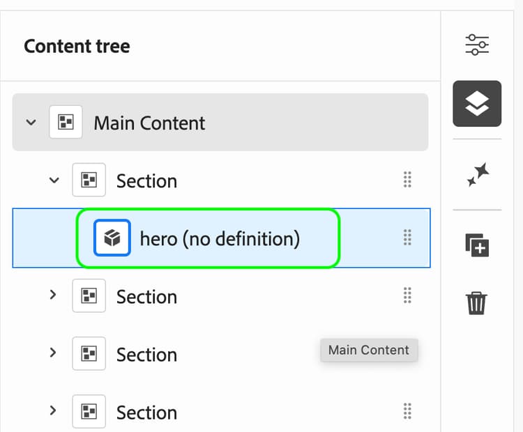
Navigate to the content tree in Universal Editor and select the block. The overall site structure is automatically detected by Universal Editor. This includes all the block. Blocks in your project without Universal Editor instrumentation will be shown with (no definition) appended.
- Open developer console in your browser and change to the network tab.
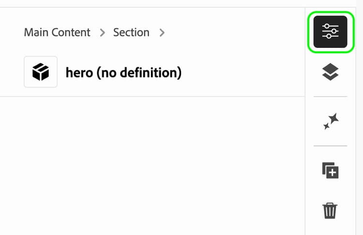
- Open the block properties in the Universal Editor.
-
The properties panel will be empty as the block has no instrumentation yet.
-
The properties panel will be empty as the block has no instrumentation yet.
-
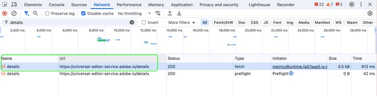
Inspect the /details call via the network tab.
-
Inspect the call response via the "preview" tab, it should look similar to the following:
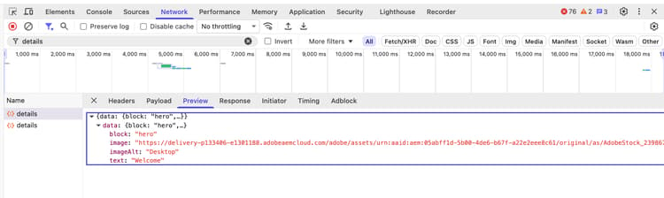
You we get a detailed list of the parsed block content with CSS selectors. These CSS selectors are needed for the next step to create the component definition and component model of your block.
Test the block instrumentation
Testing the new block in Universal Editor is easy. The change must only be pushed to a branch.
Once the changes have been pushed to a branch, they can be tested as follows:
- Open a test page from da.live.
- If the Universal Editor is configured as default editor it will open in Universal Editor. If the page opens in the document editor click the Open in UE button on the right side of the page content.
- The Universal Editor will usually open with your page in WYSIWYG mode on the
mainbranch. - Change the Universal Editor URL to you branch and test Open in UE for your Experience Workspace site and change the URL to the created branch to
https://<branch>--<site>--<org>.ue.da.live/<path> - Navigate to a content section.
- Click
+on the side navigation bar of Universal Editor to add the new block
Using block options (classes)
Some blocks may support one or more block options (CSS classes applied to the block). Instead of authors writing the block class names in the block header, there are two naming conventions, which will be treated as a special case by the back-end.
In the first case, each option/class can apply is its own boolean field that can be toggled on/off. These fields must start with classes_ in order to be treated as classes by the backend and will be combined into a class list during rendering.
In the second case, the options is a comma-separated string, which authors can set through a (multi) select, or a text field. This is usually a single or multiple select component, depending on the block options supported by the block. A simple text field also works, but this is inconvenient for the author. Unlike content components, block options are not defined by a CSS selected as a name in the component models. The fields are simply named classes.
Example 1: Toggling a class
Add a field with the name prefixed with classes_ to the block's fields in the component models.json. The name after the classes_ prefix will be used as the class name when the field is set to true. For instance, if classes_autoplay is checked in the editor, the class autoplay will be applied.
[
  {
    "id": "video",
    "fields": [
      {
        "component": "boolean",
        "name": "classes_autoplay",
        "label": "Autoplay Video",
        "valueType": "boolean"
      },
    ]
  }
]
Example 2: Class list
To allow setting multiple classes, the classes field name must be used. A text field or multi-select can be used. The string set will be treated as a comma-separated list of classes, each being applied to the block.
[
  {
    "id": "section",
    "fields": [
      {
        "component": "multiselect",
        "name": "classes",
        "label": "Classes",
        "options": [
          {
            "name": "Highlight",
            "value": "highlight"
          },
          {
            "name": "Primary",
            "value": "primary"
          }
        ]
      }
    ]
  }
]
Additional Scripts for the Universal Editor
In some situations, it is necessary to execute additional JavaScript code only when the page is loaded using the Universal Editor and while content changes are done by the partitioner.
The most common cases for this are:
- A block of code that modifies the DOM in such a way that the Universal Editor instrumentation (data attributes) is lost. For example, if the code replaces a block
divwith anul/li. - The block needs to react to author actions while loaded inside the editor. For example, an accordion should expand the selected item, or a carousel should jump to the selected item and stop autoscrolling while being edited.
This can be achieved by loading extra JavaScript code via ue.js.
The ue.js is loaded via scripts.js see code snippet below only in Universal Editor.