Set up library
Your library is a selection of blocks, templates, and icons that you predefine for your authors at the project level to help them create their content fast.
Introduction
Creating content is about more than just editing and formatting text. Compelling content is made up of different blocks and is kept consistent with templates and placeholders.
By setting up a library for blocks, placeholders, and icons, you help your authors create the right structure for their documents. You define your library by first creating your blocks and templates, then creating sheets to organize them, and finally adding a configuration for the library linking it all together in the following steps.
- Create block documents - Create individual documents for each block under a
blocksfolder. These documents define the blocks that authors will insert into their documents. - Create a blocks sheet - Create a sheet called
blocksunder alibraryfolder. The sheet collects all the blocks you have defined for the project. - Create template documents - Create individual documents for each template under a
templatesfolder. Template documents contain required blocks, section breaks, section metadata and metadata blocks that can be reused while building pages based on this template - Create a templates sheet - Create a sheet called
templatesunder thelibraryfolder. The sheet collects all the templates you have defined for the project. - Create an icons sheet - Identify the locations of the icons that authors can add to the documents.
- Create a placeholders sheet - Refer to Placeholders documentation to set up placeholders as per the project requirements.
- Update project config sheet - Update the project configuration with your blocks, templates, and icons.
Create block documents
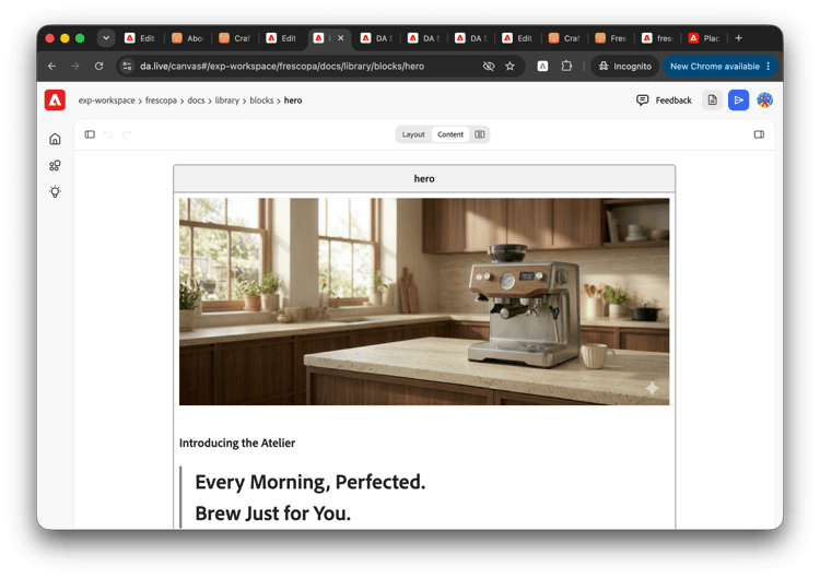
Blocks are represented by tables within documents. Each document contains one type of block, e.g. cards, columns, hero, etc. Block documents are typically placed within a folder called blocks that itself is typically in a folder called library.
Create a document named after the block. Then simply add a table to it to represent the block.
- The first or heading row has the block name.
- The subsequent rows contain the block content.
You can create variants of the same block within the same document to accommodate differences in what the blocks will hold. Two types of variants are allowed.
- Visual variants are when different styling is required for the same content within the same block. For example a normally formatted table or a table with graybar effects.
- Visual variants are distinguished by appending the variant name in parenthesis behind the block name in the block heading row. For example
table (default)andtable (graybar). - This variant name in parenthesis is used in the block selector dialog to help the author choose the appropriate block.
- The variant name is appended as a CSS class to the resulting HTML.
- This takes advantage of the block options Edge Delivery Services feature.
- Visual variants are distinguished by appending the variant name in parenthesis behind the block name in the block heading row. For example
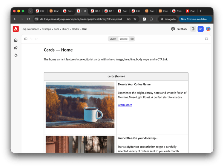
- Content variants differ only in the content they hold. For example you might want a Cards (tiles) as well as Cards (home page).
- No additional CSS class is appended to such variants.
- Content variants are distinguished by a document heading ahead of the block table.
- This heading is used in the block selector dialog to help the author choose the appropriate block.
All the variants of a block will be displayed to the author as individual items under the same block name when inserting content.
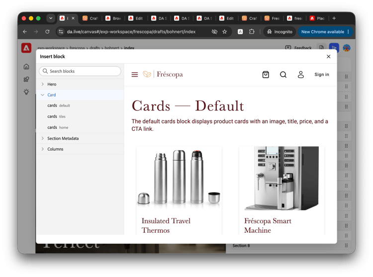
Block library metadata
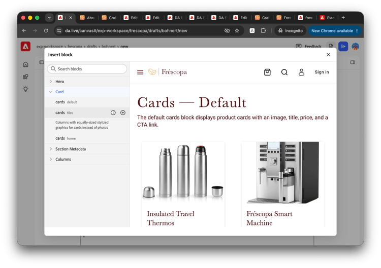
Sometimes the difference between blocks can be nuanced. To help your authors choose the right block, you can add metadata at the end of each block in its own block.
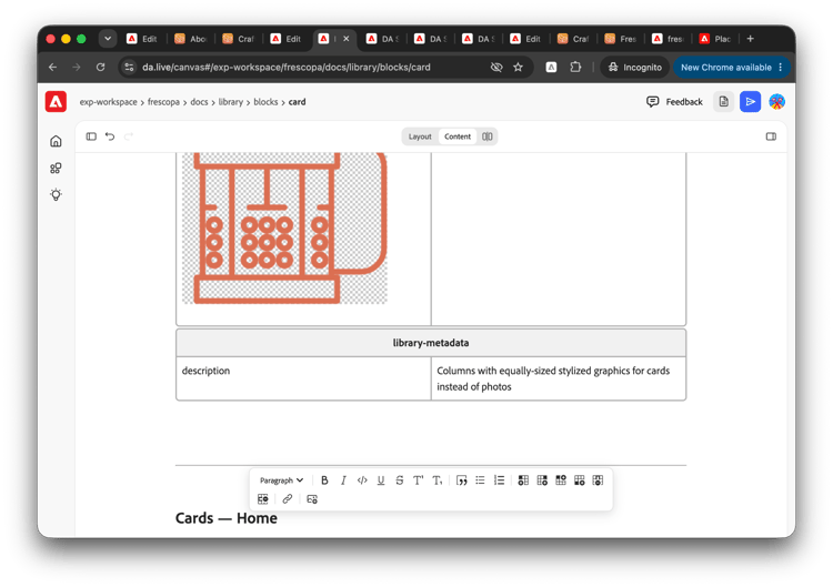
The block heading must be library-metadata and it can have one description content row. The description holds a description that is shown in the block dialog when the author clicks on the information icon.
Library Start and End Markers
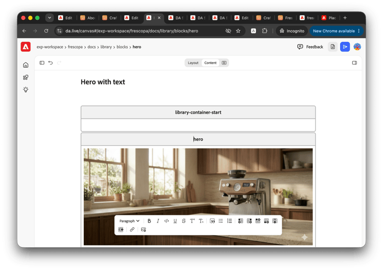
In some scenarios, it can be useful to authors to carry additional content along with the block when copied to the document. For example, when you want to carry a heading along with the block, or when using auto-blocking for multi-section blocks like accordions and tab containers. This can be accomplished by wrapping your block library content with special marker blocks library-container-start and library-container-end.
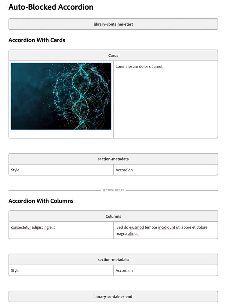
When used, all content between the start and end marker blocks gets added to the to document.
Create a blocks sheet
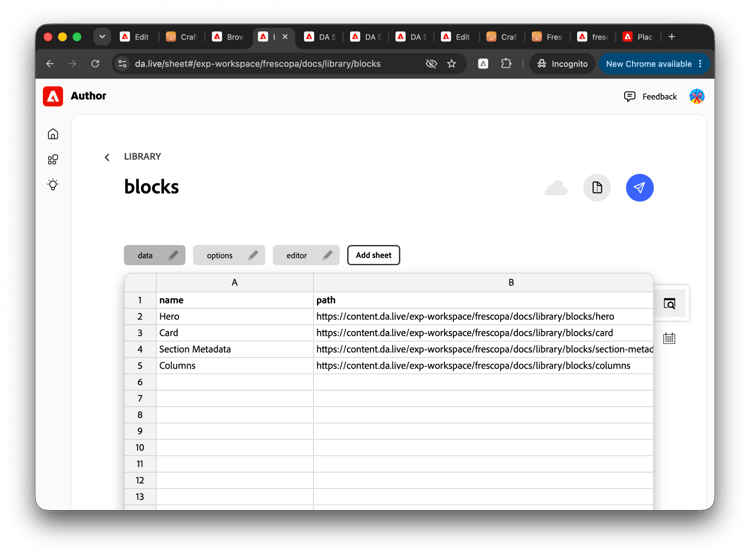
Once you have created all of your blocks as documents, you need a central list of all of your blocks. This sheet is typically created in the library folder alongside your blocks folder.
Create a sheet called blocks with two columns name and path.
nameis displayed to the author when selecting the block.pathis the link to the block document itself format ofhttps://content.da.live/{org}/{site}/library/blocks/{blockname}
Block options
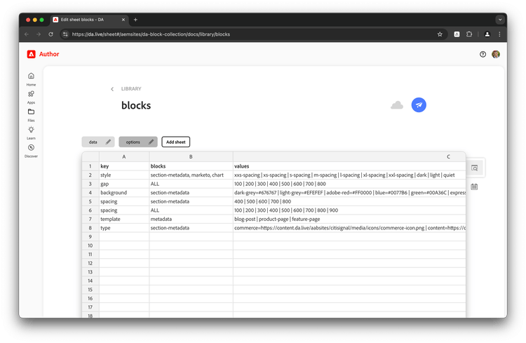
With predefined block options Experience Workspace can guide the author with a set of available options, especially for key-value-based blocks like section-metadata or metadata.
You can specify pipe delimited key / value pairs that provide your authors with values if the key column and block name match.
Columns
- key: the metadata or section-metadata key, e.g. title, category.
- blocks: the block(s) the option applies to. Use metadata for page metadata. Separate several blocks with commas.
- values: optional pipe-delimited list of values. Use Label=value to show a friendly label while storing a different value. Leave it empty for a free-text field.
- type (optional): how the field is edited.
- empty or single: one value. A dropdown if values are listed, otherwise a text field.
- multi: several values at once, shown as checkboxes and saved comma-separated.
- json: a multi-line field for JSON content such as JSON-LD structured data.
- label (optional): the name authors see for the field. Defaults to the key.
Note: if you specify name=colorValue (for example adobe-red=#FF0000), authors see a color swatch next to the option, both in the slash menu and in the Page panel.
| key | blocks | values | type | label |
| style | section-metadata | xxs-spacing | xs-spacing | x-spacing | ||
| background | section-metadata | dark-grey=#676767 | light-grey=#EFEFEF | adobe-red=#FF0000 | blue=#0077B6 | green=#00A36C | express-gradient=linear-gradient(90deg, rgba(63,94,251,1) 0%, rgba(252,70,107,1) 100%) | ||
| title | metadata | Page title | ||
| description | metadata | |||
| category | metadata | News | Blog | Event | multi | Category |
| theme | metadata | light=#FFFFFF | dark=#1A1A1A | Theme | |
| json-ld | metadata | json | JSON Schema |
Columns
- key: the metadata or section-metadata key, e.g. title, category.
- blocks: the block(s) the option applies to. Use metadata for page metadata. Separate several blocks with commas.
- values: optional pipe-delimited list of values. Use Label=value to show a friendly label while storing a different value. Leave it empty for a free-text field.
- type (optional): how the field is edited.
- empty or single: one value. A dropdown if values are listed, otherwise a text field.
- multi: several values at once, shown as checkboxes and saved comma-separated.
- json: a multi-line field for JSON content such as JSON-LD structured data.
- label (optional): the name authors see for the field. Defaults to the key.
Note: if you specify name=colorValue (for example adobe-red=#FF0000), authors see a color swatch next to the option, both in the slash menu and in the Page panel.
Edit page metadata
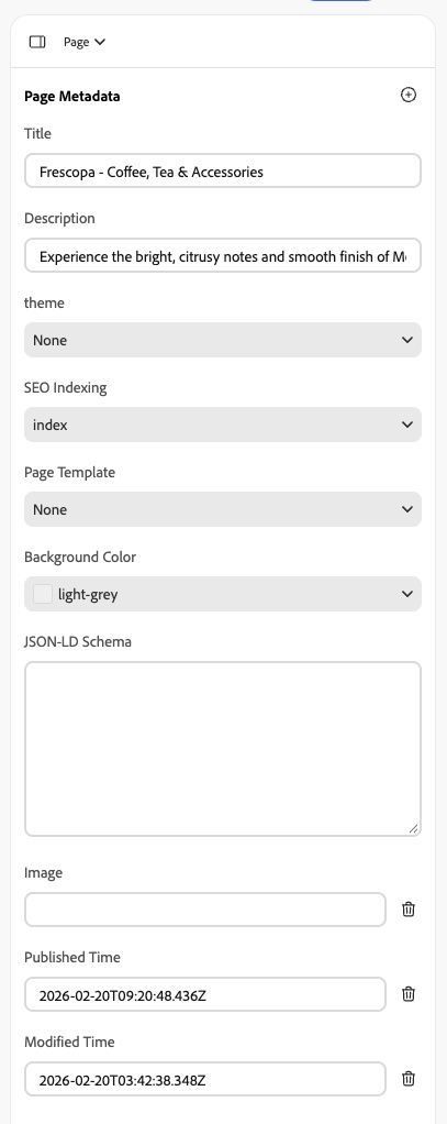
The Page side panel in Experience Workspace lets authors view and edit a page's metadata (title, description, and any custom properties) without touching the metadata table in the document.
To open it, select Page in the tool panel menu on the right.
Which fields are shown?
- No block options configured: the panel shows Title and Description as text fields.
- Block options configured for metadata: the panel shows exactly the fields defined in your options sheet, in the sheet's order, using each field's label and type.
- Other metadata on the page: any property in the page's metadata table that isn't one of the fields above is listed too, as a text field.
Enable focal points
If a particular block supports the focal points feature in its client-side code, you can enable this feature for the block.
Please see the document Enabling focal points for details.
Create template documents
With your blocks created you can create template documents made up of blocks that your authors can use to quickly create their documents. Template documents generally contain a full page with required blocks, section-metadata, and metadata blocks. When an author adds the template to the currently opened document, the entire contents of the template will be inserted into the document.
Template documents are typically placed within a folder called templates that itself is typically in a folder called library.
Create a templates sheet
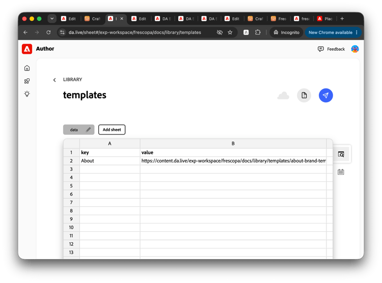
Once you have created all of your templates as documents, you need a central list of all of your templates. This sheet is typically created in the library folder alongside your templates folder.
Create a sheet called templates with two columns key and value.
keyis displayed to the author when selecting the template.valuevalue is link to template document in the format ofhttps://content.da.live/{org}/{site}/library/templates/{templatename}
Create an icons sheet
In addition to structuring content with blocks and templates, authors can also add icons to their content to add visual distinction. To do so, the icons must be added to the library by first creating a list of the available icons as a sheet. This sheet is typically created in the library folder.
Create a sheet called icons with two columns: key and value.
valueis displayed to the author when selecting the icon.keyis in the format::key::and is the text that is inserted into the document representing the icon.iconis the link to the icon file in the format ofhttps://content.da.live/{org}/{site}/{path-to-icon}.svg
Update project config sheet
Now that you have defined your blocks, templates, and icons, you need to make these available to your project by adding a library tab to your project configuration.
- Navigate to your project’s root at
https://da.live/config#/{org}/{site}/. - Click the gear icon in the breadcrumbs to edit the project’s configuration.
- Add a tab to the configuration sheet called
library. - Add the rows for blocks, templates, placeholders, and icons so AEM knows where to find these resources when your authors choose to insert them into their content.
| title | path | format | ref | icon | experience |
Blocks |
https://{path-to-blocks}.json |
||||
Templates |
https://{path-to-templates}.json |
||||
Icons |
https://{path-to-icons}.json |
:<content>: |
Validate library setup
Once you have set up your library, place yourself in the author’s role and edit any document in your project.
- Change your view to Content.
- Place your cursor where you wish to test your library setup.
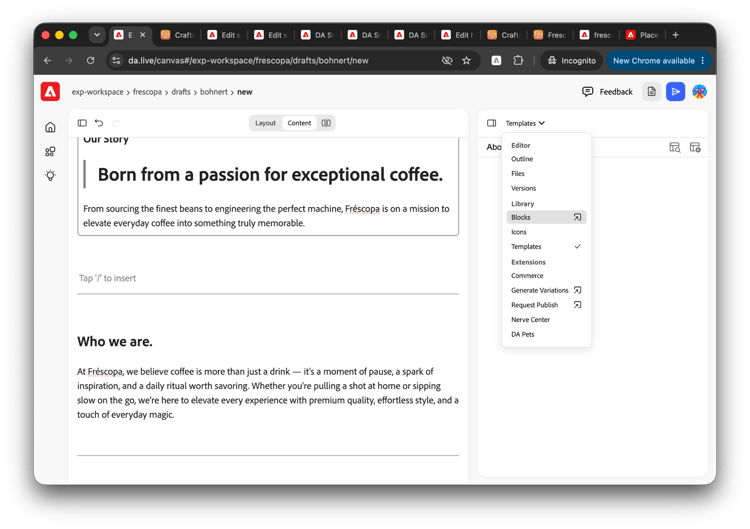
- Open the tools panel.
- Select Blocks.
The blocks dialog opens and shows you what you configured previously. Repeat these steps for templates and icons.