
Authoring pages
Experience Workspace builds on the knowledge you already have from using common productivity tools used to create pages. It does this by providing a familiar and an intuitive environment to create your content.
There are a couple of usage patterns unique to Experience Workspace that make its usage more efficient.
- The edit menu is contextual. For example, when clicking into a table an Edit Table button is exposed in the edit menu.
- Palettes stay open, menus do not. Similar to Adobe Creative Cloud, larger palettes that may need to be used while working in the page will stay open. Library plugins can opt to close the library palette if the interaction should be a one-time event (like selecting a tag). Menus like the expanded text menu will close after click.
- Blocks available depend on your project. Your content is generally made up of blocks. What blocks you can choose from depends on your project’s library setup and its content.
If you are not yet using Experience Workspace, please see the document editor documentation.
Overview
The content editor is made up of three primary parts.
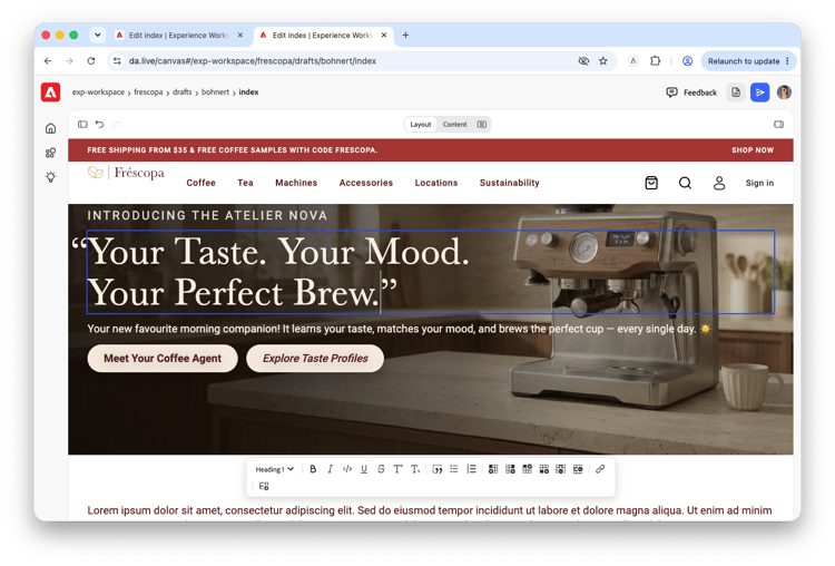
- The editor menu - Located at the top of the editor, the toolbar allows you to switch modes and hide or show the assistant and tool panels.
- The editor - The editor itself is where you can edit your content directly. Depending on your mode, it can be a WYSIWYG experience (Layout) or based on the underlying page (Content).
- The editor toolbar - The editor toolbar provides your formatting options for the content you are currently working on. It is context based, showing only options relevant to your selected content.
The editor menu

The editor menu provides access to the different modes of the editor as well as options to show/hide additional panels and undo/redo options.
| Icon | Option | Description |

|
Show assistant panel |
Show or hide the assistant panel. By default the assistant panel is hidden to give you more space to focus on your content. If you do not see the assistant panel or the icon to show it, it may have been disabled for your organization or site level. |

|
Undo/redo |
Undo or redo the previous edit. You can also use shortcut keys
|

|
Layout mode | When editing a page with Experience Workspace, by default Layout mode is active. Layout mode presents your content as your readers will experience it. |

|
Content mode | Content mode presents your content as the underlying document that represents the page. In this mode you can more easily see the blocks that compose the page, free of any rendering. |

|
Split view | Split view opens layout view and content view side-by-side to allow you to easily compare the layout of the content with its underlying page structure. |

|
Show tools panel | Show or hide the tools panel |
The Editor
The editor is where you directly manipulate your content. Depending on which mode you are in, the content will be presented differently.
Editing in Layout mode
When editing a page with Experience Workspace, by default Layout mode is active. Layout mode presents your content as your readers will experience it.
Click an item on the page, and if it is editable, it will be selected with a blue border and you can edit in place.
Layout mode provides a what-you-see-is-what-you-get (WYSIWYG) editor and any changes you make are updated in place and in real time.
Once you select an item to edit, the toolbar appears to provide you with in-context options. If you have the tools panel open to outline mode, the block you selected will be selected in the content outline.
Editing in Content mode
Content mode presents your content as the underlying document that represents the page. In this mode you can more easily see the blocks that compose the page, free of any rendering.
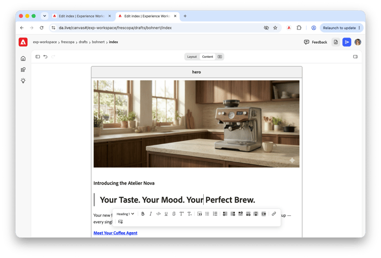
Unlike layout mode, content mode presents your content as a continuously-flowing page. Click anywhere to edit the content.
Content mode is also an editor. Once you select an item to edit, the toolbar appears to provide you with in-context options. If you have the tools panel open to outline mode, the block you selected will be selected in the content outline.
Split view
Split view opens layout view and content view side-by-side to allow you to easily compare the layout of the content with its underlying page structure.
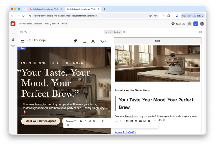
In split view, you can edit in both the layout and content panels.
The editor toolbar
The editor toolbar provides you with common text formatting options.

| Icon | Option | Remarks |

|
Style | Paragraph, heading, or code block |

|
Bold | Command+B or Control+B |

|
Italic | Command+I or Control+I |

|
Inline code | |

|
Underline | Command+U or Control+U |

|
Strikethrough | |

|
Superscript | |

|
Subscript | |

|
Blockquote | |

|
Bullet list | |

|
Numbered list | |

|
Indent | |

|
Outdent | |

|
Create link | |

|
Add image | Upload an image to the page |
Select your text and then the option to format it. Depending on the context, the editor toolbar will show additional options. For example if your text is in a table, table formatting options are shown.

| Icon | Option | Description |

|
Add column left | Add column to the left of the cursor |

|
Add column right | Add column to the right of the cursor |

|
Add row above | Add row above the cursor |

|
Add row below | Add row below the cursor |

|
Delete column | Delete the column the cursor is in |

|
Delete row | Delete the row the cursor is in |
The options available to you on the toolbar depend on the context and the block library that is configured for your project.
Blocks
Blocks help you add structure to your page. By adding a block, you identify a section of your content as a block and can thereby apply particular formatting to it based on the type of block.
Blocks are simply tables of two rows:
- The header - This contains the type of block.
- The content row - This contains the content of the block.
Blocks are most obvious in Content mode where your page is not rendered as it would be in Layout mode.
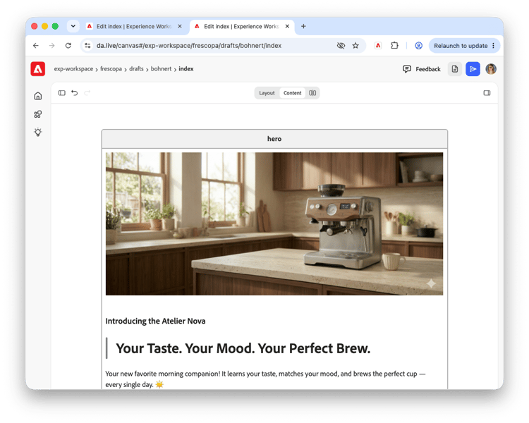
In this example, there is a hero block shown by the healing row of the table. The content that makes up the hero follows in the content row. Note that the content can itself contain additional formatting.
See how the block is rendered by switching back to Layout mode.
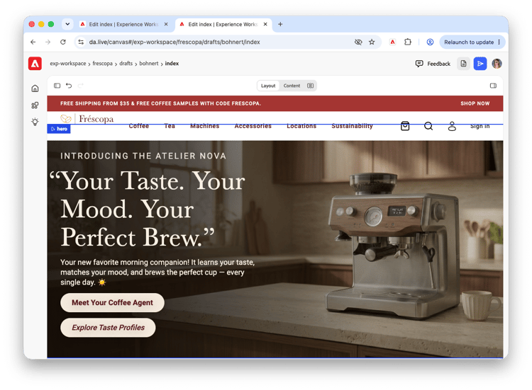
Blocks therefore give you a way to “mark” sections of content so that they are formatted and rendered for your readers in a particular way.
- Selecting a block in Layout view marks it in a blue outline with a tab of the blocks type
- Selecting a block in either Layout view or Content view selects the same block in the outline in the tools panel (if it is showing).
Adding blocks
How you add blocks depends on your context.
In Content mode
In Content mode you can insert a block directly in context by pressing the slash (/) key.
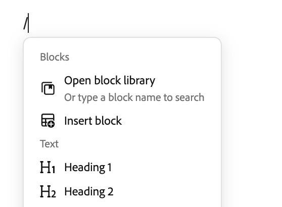
The slash key opens the context menu and you can select from the available blocks in the Blocks section.
In Outline mode of the tools panel
If you have the tools panel open to the outline mode, hovering over a section shows the add block button.
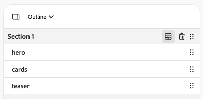
Click it to open the Insert block dialog.
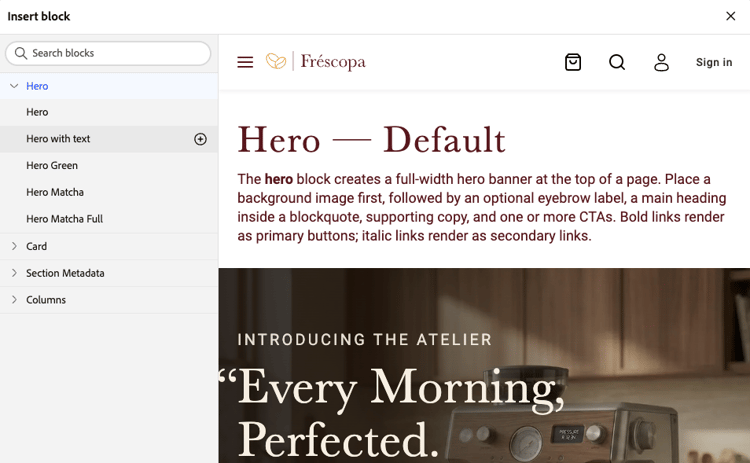
Select the block you wish to insert and click the plus icon to insert it into your page.
Using the Models dialog from the tools panel
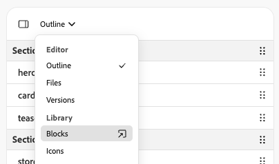
If you have the tools panel open, you can select the Blocks option in the mode drop-down to open a dialog to select a block to insert into the page where your cursor current is.
Removing blocks
Like adding blocks, deleting blocks depends on your content.
In Content mode
In content mode you can simply highlight the entire table that composes your block and press the backspace key to delete as you would any other content in the page.
In Outline mode of the tools panel
If you have the tools panel open to the outline mode, hovering over a section shows the delete block button.
Adding focal points
If your blocks support the focal point feature, you can define the focal point of images in the block. Please see the Focal points document for more information about setup and usage.
Adding templates
Templates help you create your page by basing it on a predefined layout. Templates are simply page made up of multiple blocks with predefined content that you can copy into your own page.
-
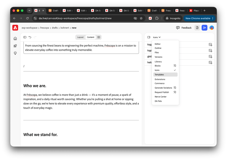
Open the tools panel and switch to Templates mode.
-
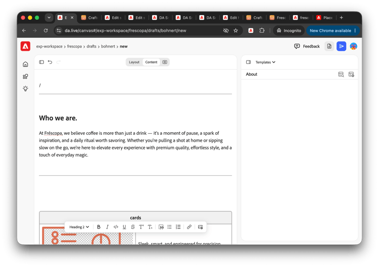
Templates mode opens in the tools panel listing the available templates.
- Click one of the buttons of the entry in the list to:
| Icon | Option |

|
Preview the template |

|
Insert the template where your cursor currently is in the page |
Select the block you wish to insert and click the plus icon to insert it into your page. The template is copied into your page.
You can edit it as you would any other content in your page.
Adding icons
Icons allow you to add visual distinction to your page.
-
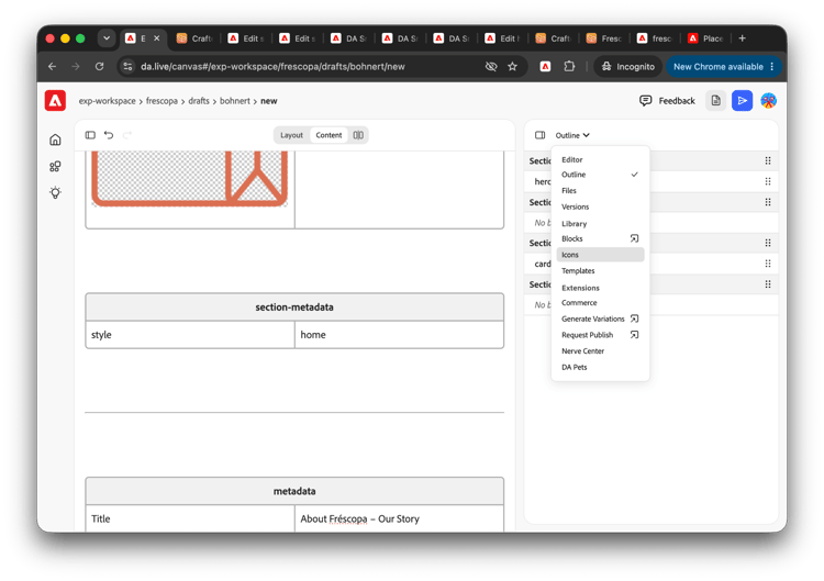
Open the tools panel and switch to Icons mode.
-
Icons mode opens in the tools panel listing the available icons.
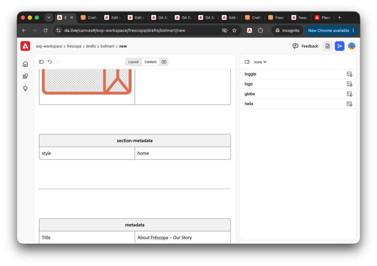
- Click the add icon to add the icon to your page where your cursor currently is.
In Layout and Content mode, the icon is represented by its key, surrounded by double-colons. When published, your readers will see the actual icon.
Collaboration
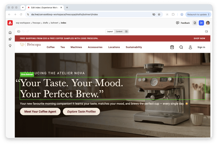
When a colleague is working on the same page as you, the block they are editing is highlighted in a green box with their name as they make the change.
Authoring sheets
Sheets are used to store tabular data in Experience Workspace, similar to spreadsheets you are already familiar with.
Because of their tabular nature, sheets open in their own editor. Please see the document Authoring sheets for more details.