
Document editor
If you have not yet migrated all projects to Experience Workspace, you may still be using the document editor to author content for your site. The document editor gives you a familiar, document-based UI for composing your content with access to tools you need to add media, blocks, etc.
Background
Experience Workspace is an evolution of Document Authoring (DA) and the coexistence of two editors is a result of this.
- If Experience Workspace is enabled for your org, by default all new projects are enabled to use the Experience Workspace editor. This is the editor with
/canvasin the URL. - If you are working on an established project, it may still use the previous editor. This is the editor with
/editin the URL.
This document describes the latter.
Orientation
The interface of the document editor is based around the document. The document sits at the center of the window. Click to begin editing similar to how you would in any other document editor.
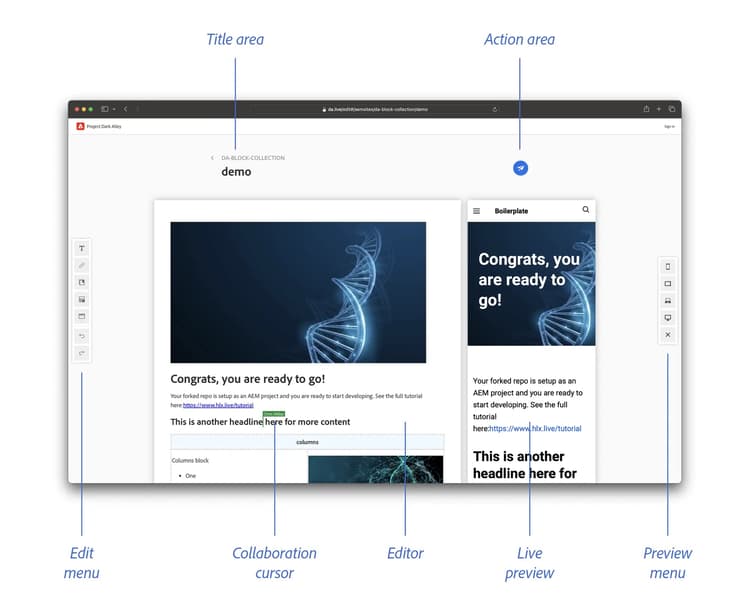
- At the top-left are the breadcrumbs. These don't reveal the full path of the document, but the next step up (
..). Click to jump back to the document's location in the content browser. You can also use the browser's Back button. - At the top-right are the Prepare button and Publish button. Use these to access pre-publication checks/tasks and to preview/publish your content.
- The Publish button follows you in the bottom-right corner of the screen as you scroll down your document.
- To the left is the edit menu. The edit menu is contextual. For example, clicking into a table will expose the edit table button.
- To the right of the content are the action tabs. Depending on the options enabled on your environment, these might include Live Preview and Version History.
Edit menu
The edit menu offers basic formatting options similar to document editors you are likely already familiar with. The edit menu is contextual. For example, clicking into a table will expose the edit table button in the edit menu.
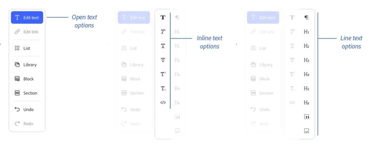
Click on an option to reveal additional, related options. For example, click on the Edit text button to reveal different text formatting options or List to reveal different types of lists to insert.
- Edit text to apply formatting to selected text
- Edit link to insert, edit, or remove a link
- List to format selected text as ordered and unordered lists or to adjust indentation levels
- Library to insert predefined options from your library to enrich your content
- Block to insert a new block or adjust an existing block by adding or removing rows/columns
- Section to insert a section break into your content
- Undo/redo to undo the previous edit action or redo it
Blocks and tables
Blocks help add context to the content you create. Blocks are represented as tables in your document. Blocks have a title row that identifies the table.
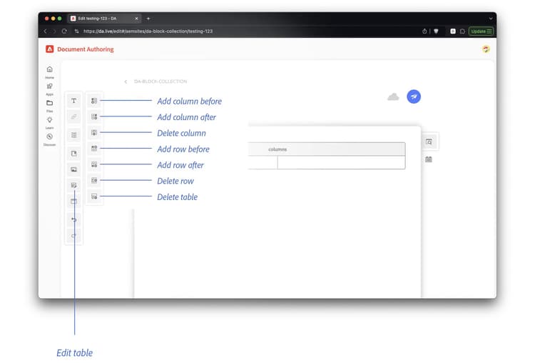
The Block button is contextually aware. Clicking into a block/table will change the Block button to an Edit block button.
- Insert column before
- Insert column after
- Delete column
- Insert row before
- Insert row after
- Delete row
- Delete block
When mousing over a block, a double-ellipsis button is shown at the top-left. Click it to easily select the entire block.